
Font Pairing: How to Crush Your Next Awesome Design
Graphic Designers use design to create messages that are visually pleasing. The design is well-suited to the audience, and also easily readable. This makes typography and font pairing an essential part of good design.
“Type is a beautiful group of letters, not a group of beautiful letters.”- Matthew Carter
What is Typography?
Typography is the art and science of arranging types (also known as fonts.)
Typography has a big impact on how people perceive designs. Careful selection of typeface can be as important as other graphic elements like logo, colors, images, etc.
Think about this: every day, we see so many ads that encourage us to buy products or services. Whether it’s a print, online or television ads, they all have one common thing—carefully arrangement of font pairing.
Graphic designers position product names in big colorful text blocks. The designer often then crafts legally binding agreements in simple small prints. This strategic arrangement of the text is known as typography. It is an integral part of different art and communication styles. Basically, it describes the way a designer arranges and presents texts.
What Does Typography Have to Do with Font Pairing?
You may be a bit confused as to what typography has to do with font and different font pairings. Although the lines have been blurred quite a bit and these terms are often now used interchangeably, here’s the answer to that question.
Typography traditionally refers to the design of type or all the words on a page. Font refers to a particular piece of type in a size and weight. Therefore, a typeface is often a gathering of many fonts, and typography is the art and science of creating that big-picture design using fonts.
To help you get started on becoming a typography expert, we have come up with the ultimate guide to font pairing. This can help you in creating presentation, social media graphics, companies logo, or anything you would like to design.
Establish the Aim of Your Design
When embarking on a new design, it’s important to keep the overall goal of the design piece in mind. Is it to get sales, inform and educate, or inspire action? This is important to know when planning the look and feel of the design.
Furthermore, it is also important to keep font selection and pairing fairly basic. When you choose multiple fonts, it’s essential to maintain harmony and unity to make them work together.
How Many Fonts Should You Use?
There are thousands of fonts available today. How many fonts you use in your design is entirely up to you. However, there are some general guidelines to keep in mind.
Like humans, fonts too have personalities. And just like humans, these personalities can sometimes clash. Though there is no hard rule on a specific number of fonts, using multiple fonts in the same design can be difficult. But if you manage, the result can be exceptional.
Try to make a selection with numerous variants and weights to make the best of both worlds. You can then take advantage of a variety of styles, knowing that they are complementary to each other.
The Three Types of Font Pairing Relationships
When considering font pairing, there are three types of font pairing relationships to keep in mind:
Concord:
Fonts with similar traits are Concord. They have identical word spacing, height, and size. There are thousands of classification for the type. However, they are usually divided into four primary categories, each with endless sub-categories:
- Serif: Caslon, Georgia, Garamond, Century
Sub categories: Modern, Slab, old style, etc. - San-Serif: Opima, Arial, Hevetica, Avant Grate
Sub categories: Humanist, Grotesque, etc. - Script: Billabong, Aguafina, Spencerian, Mistral
- Decorative: Velo Sans, Jokerman, Rosella, Respira Black
Contrast:
When we talk about contrast, it includes style, weight, size, and color. It can be a complicated way to pair fonts but can generate more original and unique typeface. If the typefaces are too similar or not similar enough, this also makes an impact on pairing success.
- X-height and glyph width: X is the height between the upper and lower case. Glyph width shows the wideness of the characters.
- Weight: Fonts with the thin line are light in weight; whereas, fonts with thick lines are heavy.
- The direction of the axis: Each font has a different angle in its axis. You can draw an imaginary line through each letter and see how they look together.
Conflict:
If two fonts are sharing too many similarities or have entirely different attributes, conflict ensues. You can avoid the conflicts by paying attention to the font’s category. In addition, an eye to hierarchy or a plain background will help.
Top 8 Typography Combinations for your Inspiration
Futura Bold+ Souvenir
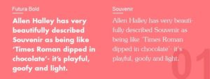
Combining such powerful personalities can be risky. But these two pairing can work well. Allen Halley has very beautifully described Souvenir as being like ‘Times Roman dipped in chocolate’- it’s playful, goofy and light. The typography came into existence in 1914. It was foreseen as a kind of a throwback to earlier Art Nouveau models.
Futura, on the other hand, is a serious, bold and optimistic concerned with modernism and forwardness. In 1927, Paul Renner by following the principles of futurism in Bauhaus created Futura. Thus, in every letter, we find almost perfect circles, triangles, and squares.
Therefore, we have two different typefaces from different time periods, and both were created for almost different purposes. In some way, this brings out the best in each other. Slightly innocent Souvenir plays into the strident personality of Futura to create a clean pairing that is instantly pleasing.
Rockwell Bold + Bembo

In 1934, the Monotype Corporation designed Rockwell as one of the traditional Slab Serifs. The typeface has a great personality; makes an impression when used in bold. Just like Futura Serif, it too has a geometric quality. Because of its boldness, it is best suited for logos and signs.
Bembo, on the other hand, is a thin yet elegant, versatile, and natural serif. Try using Rockwell for headings, titles, and website buttons. Bembo will perfectly settle under one of the best font combinations as a subtitle, body text or detail.
Helvetica Neue + Garamond
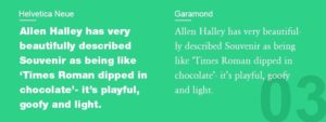
It is a pleasing classic combination. Both the fonts have distinct yet natural personalities. If you want to invite an audience into a traditional, classy, and elegant world, then use the timeless Helvetica Neue for headings and Garamond for text.
Combining the neo-grotesque sans-serif with classic Garamond serif is likely to succeed. And, this typography can work exceptionally well with corporate texts; such as presentations, publications, and even for a company logo.
Though there is no right or wrong font for logos; businesses usually prefer pairing that are easily readable. They also prefer fonts that can reflect their personality. Finally, fonts should create a visually appealing hierarchy between the two families by mixing up weights and sizes.
Montserrat + Courier New
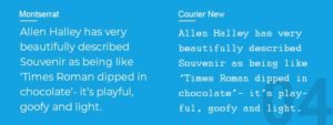
Google has recently created Montserrat font, specifically for online use. It has been very popular since the time of its launch. The typeface is elegant and sleek.
This makes it very exciting to combine it with the most known font, Courier New. This pairing is just the best of both old and new. The thick blackness of the 20th-century adds a natural weight to the smooth, intangible lightness of the online lettering of the 21st-century.
The font pairing is perfect for the brands that straddle both past and present. It helps indicate that they are moving ahead without breaking the connections to the past.
Playfair Display+ Source Sans Pro

If you want to go larger and keep a modern look for Serif style font, then Playfair Display is the excellent choice for you. The typeface was inspired by letterforms of the 18th century, which emerged during the transformation from quill to steel-tipped pens. This makes it barely surprising that the font reminds the charm of old-world, but with the hint of innovation.
Mixing it with Source Sans Pro, we push things little forward into the present, creating a discreet and attractive combination; while still being functional. Playfair display is a perfect font to add a personal touch to slogans, taglines, product descriptions, etc. Its currency and ampersand symbols are matchless.
It makes it an ideal choice for products or services that want to build upon elegant and luxury. By pairing it with Source Sans Pro, you can keep your text modern and clean. This makes a typography design that is easy-to-read and grabs the attention.
Amatic SC + Josefin Sans
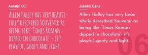
It is yet another great typography combination. The font pairing of Amatic SC and Josefin Sans may not be the right choice for corporate contexts. However, if you are an entertainer or artist who wants to convey character, then the font pairing will work well for you.
You can also use the font pairing in blogs, depending upon the style and subject. Make sure you don’t use Amatic SC font in the main body text. Otherwise, your audience will go mad. It is mainly used for headlines and titles. This is a classic example of strategic typography.
Century Gothic + PT Serif
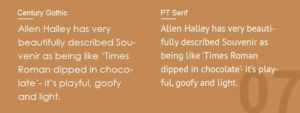
By now you have come to know that sans-serif and serif are the perfect typography combinations. Another great example of this is Century Gothic and PT Serif.
Century Gothic has taken a lot from Futura. It is very much inspired by the classic Art Deco but with a slight variation. Fortunately, these variations are enough to differentiate it from Futura. On the other hand, PT Serif has been used primarily used for paragraph text. It is a stylish typeface that is crafted elegantly. It works fantastically for font pairing.
If you want a classic pairing that isn’t overused, then these two fonts can be a smart choice.
Raleway + Lusitana
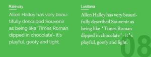
Releway is an elegant sans-serif typeface with many practical uses. Lusitana, on the other side, is used to create a welcoming, warm, and simple brand. By combining these two, you have a dynamic example of typography.
Keep in mind that you are moving into the realm of modern online esthetics by using a Google font pairing. The audience can hardly recognize it. This is because we subconsciously are aware of the old fonts, even if we don’t know their names.
There is something about Raleway and Lusitana that has never been created in foundry type; making them feel like digital new entrants. If you want to look sleek and modern, then this font pairing makes a perfect combination.
Using Font Pairing in Your Designs
Typefaces play an essential role in building brand identity. Successful font pairing makes the content easily readable. It also helps in communicating the brand message to the target audience in a better way. We hope that this guide on typography helps you simplify your approach to font pairing.